Book Covers
Totally Just for Fun
“Don’t judge a book by its cover” is very hard when you’re a graphic designer.
As an avid reader, there have been many covers over the years that I’ve judged for better or worse.
Book covers have come a long way since their invention—they are no longer just meant to hold the pages neatly. The book cover is now an essential part of the book’s identity and a key piece of marketing. Other than conveying all important information such as title and author, a book cover’s most important goal is to grab attention and intrigue the viewer enough to pick up the book. See—book covers are literally asking to be judged!
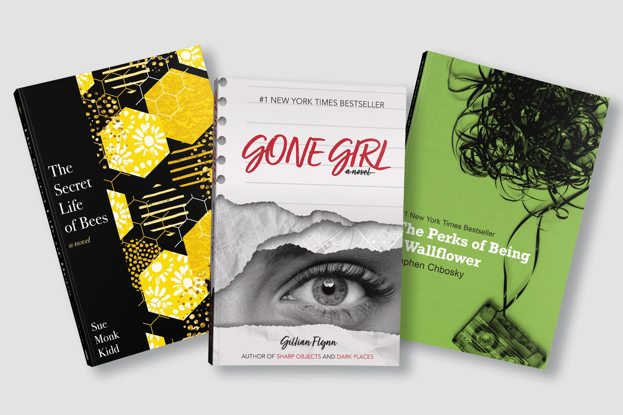
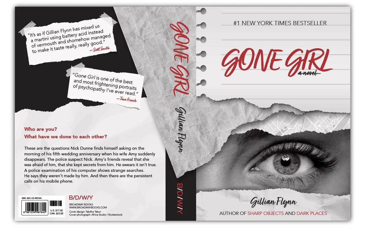
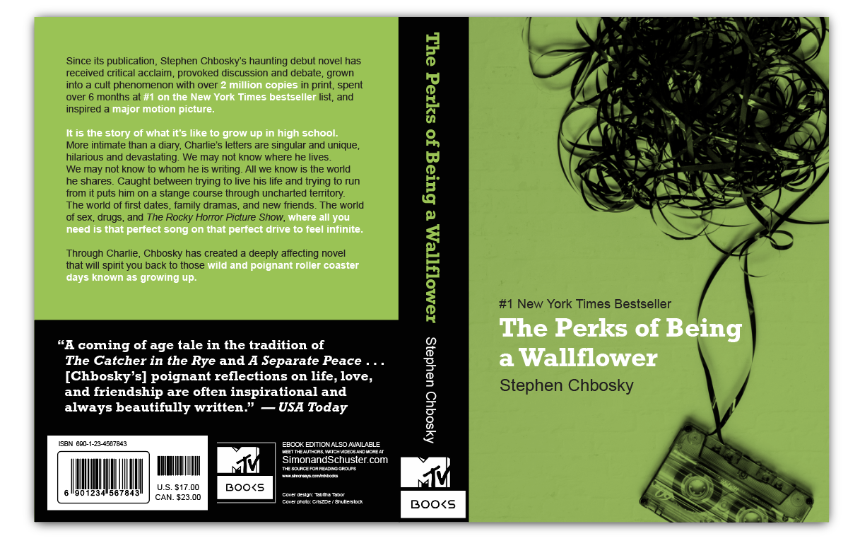
As a fun exercise, I selected three of my favorite reads and redesigned their covers using multiple layers of stock photography and a limited color palette. Each cover was designed after considering the book’s genre, target audience, story, and key themes or takeaways.

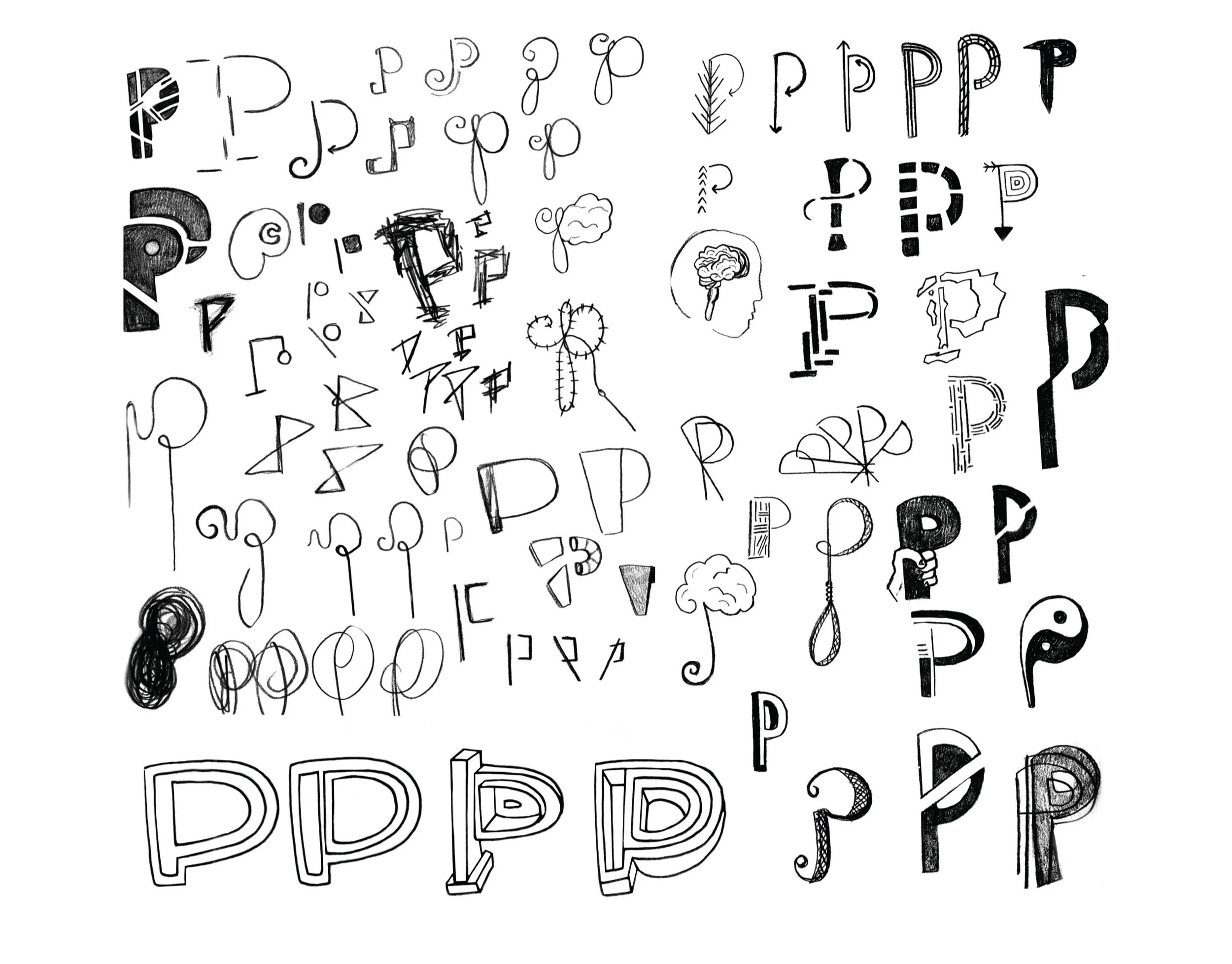
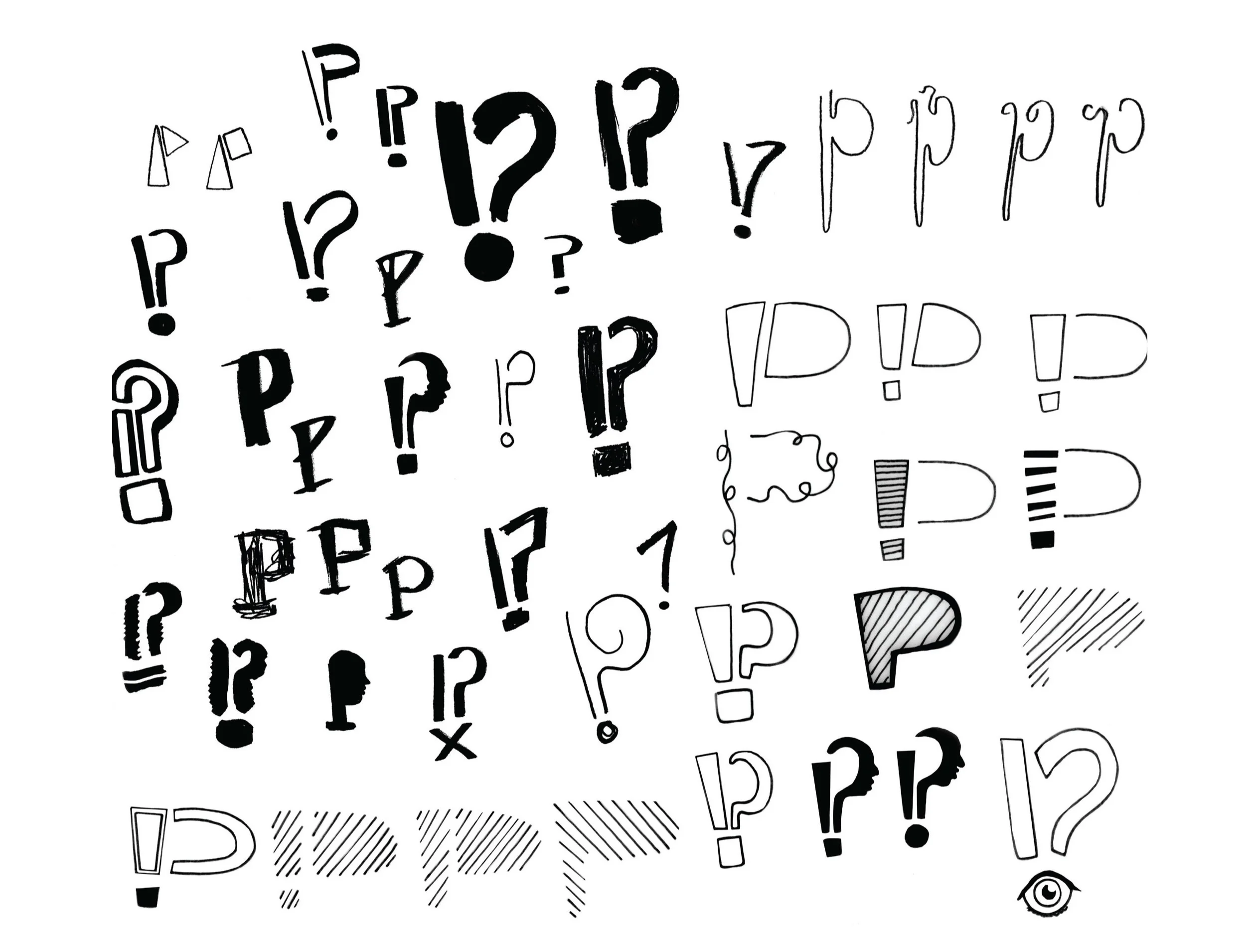
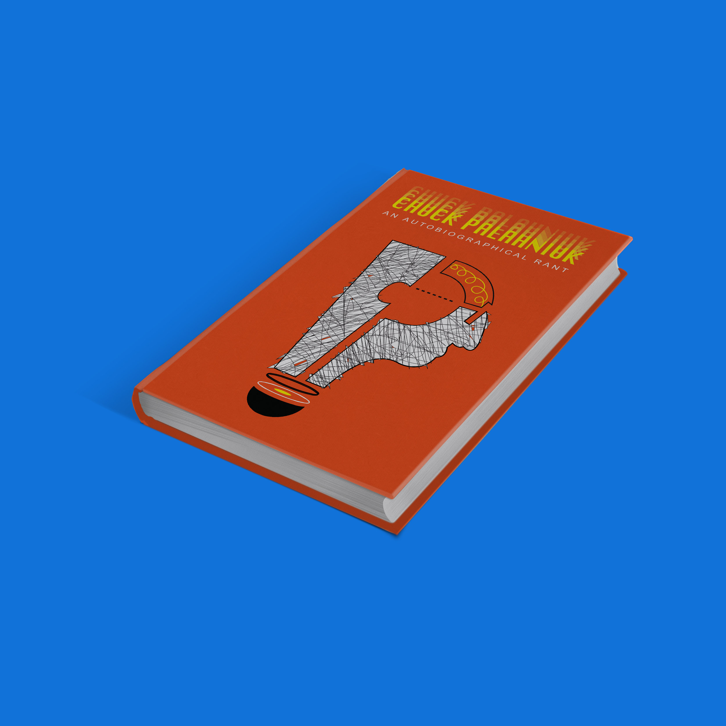
As another experimental mock exercise, I designed a book cover for one of my favorite authors Chuck Palahniuk. The challenge of this one lie with the task of first developing a unique illustrative graphic for the cover. This was heavily inspired by his writing style and the edginess of his books. With a closer inspection, one can see the icon is actually made of two main parts: an exclamation mark and a question mark—punctuation that often conveys strong emotions such as anger and confusion. The two come together to make the profile of Palahniuk’s face and also the shape of a light bulb (think: aha, an idea!) The negative space between the two symbols creates his initials “CP”. The textures are chaotic and break the shape, much like his thoughts and stories.