B2B Enterprise Campaign
The Difference Is Clear
The Difference Is Clear was the PURELL 2023 B2B enterprise campaign, designed to drive qualified traffic to GOJO.com and ultimately increase sales and conversions. The campaign focused on demonstrating to key decision-makers (KDMs) what truly sets PURELL apart—and why it outperforms competitors.
Through both messaging and visual design, the campaign reinforces a simple truth: not all hand sanitizers and surface disinfectants are created equal. The Difference Is Clear. That difference is felt the moment people encounter the PURELL brand. It inspires confidence and trust in the spaces where PURELL products are used. Users experience it on their skin with every wash or sanitize, and facility teams recognize it in the operational efficiencies delivered by PURELL surface solutions. At its core, the PURELL Difference begins with people and culminates in industry-leading products designed for real-world needs.
From concept through execution, I partnered closely with the content manager and the B2B client teams to develop a high-impact campaign that elevated the PURELL brand. Deliverables included StackAdapt banners, native advertising, and paid social assets.
Performance exceeded expectations in Q1 alone, generating over 49 million paid media impressions, 259K clicks, 81K site sessions, and 20K conversions. The campaign achieved a 54% click-through rate, outperforming benchmarks by 33%.
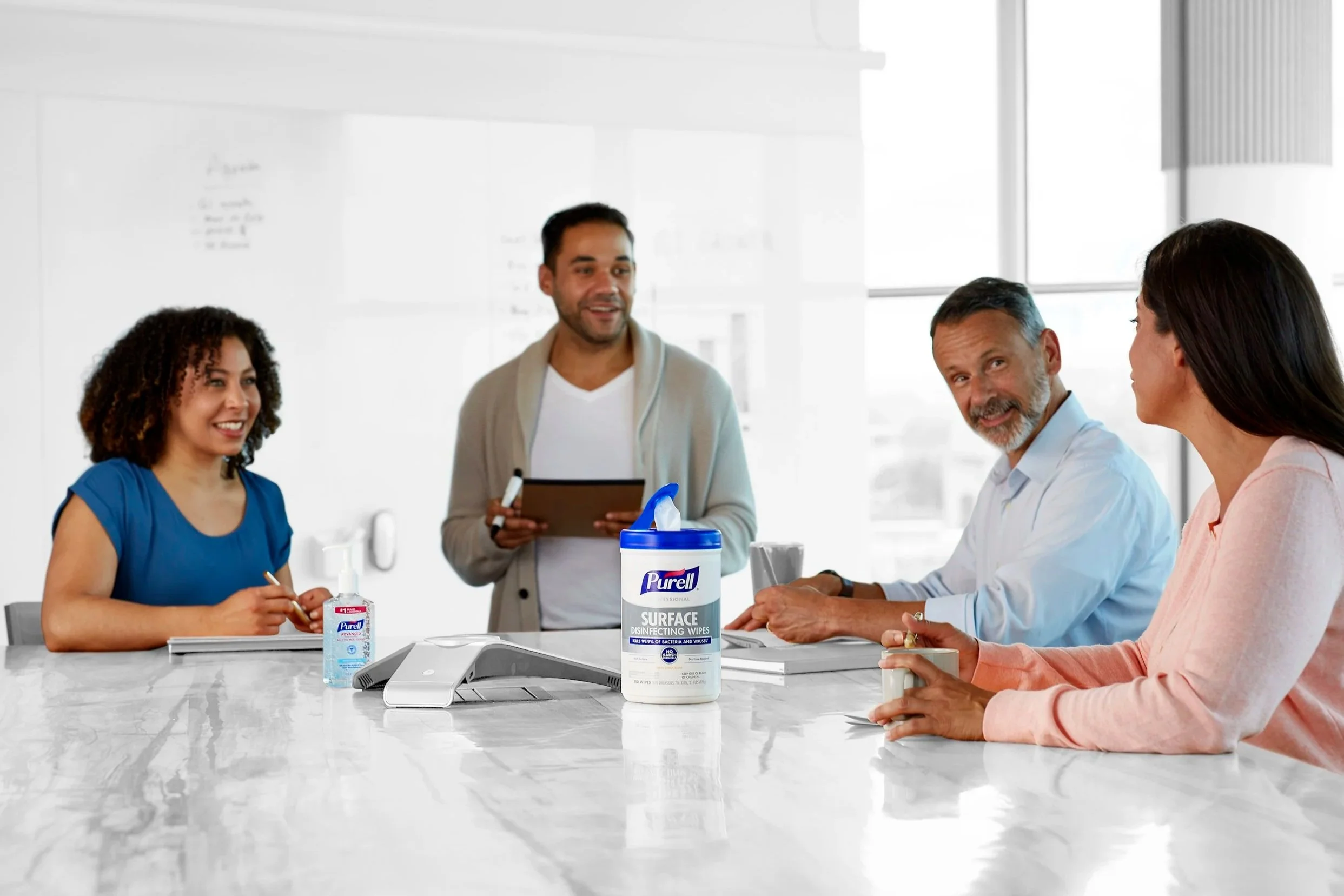
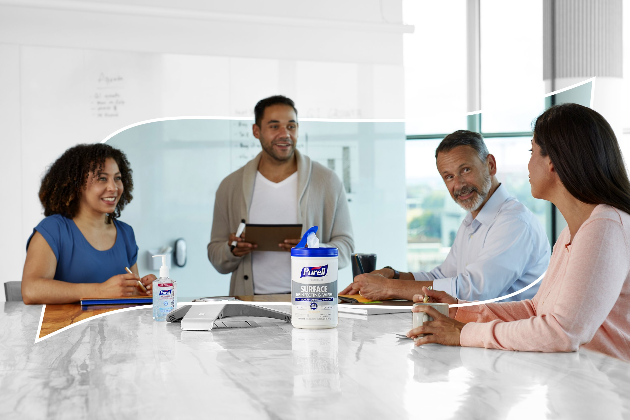
Visually, the campaign introduced a bold new style for PURELL. I reimagined brand imagery using a high-key grayscale treatment, allowing products and people to stand out in color. This approach served as a visual metaphor for the brand’s promise—PURELL visibly rises above its environment—creating an immediate and unmistakable point of differentiation.
The campaign was executed in two strategic phases: awareness and retargeting. Awareness-stage ads featured softer messaging and broader CTAs to engage a wide audience. Visually, these assets depicted people in moments of heightened germ exposure, sometimes incorporating the PURELL logo’s halo to create a colored “safe space” within the grayscale environment. Retargeting-stage ads focused on driving conversion, spotlighting specific products in use with subtle human interaction, such as hands using surface wipes. While maintaining the color-against-grayscale contrast, these executions zoomed in on the product experience to reinforce performance and efficacy.


